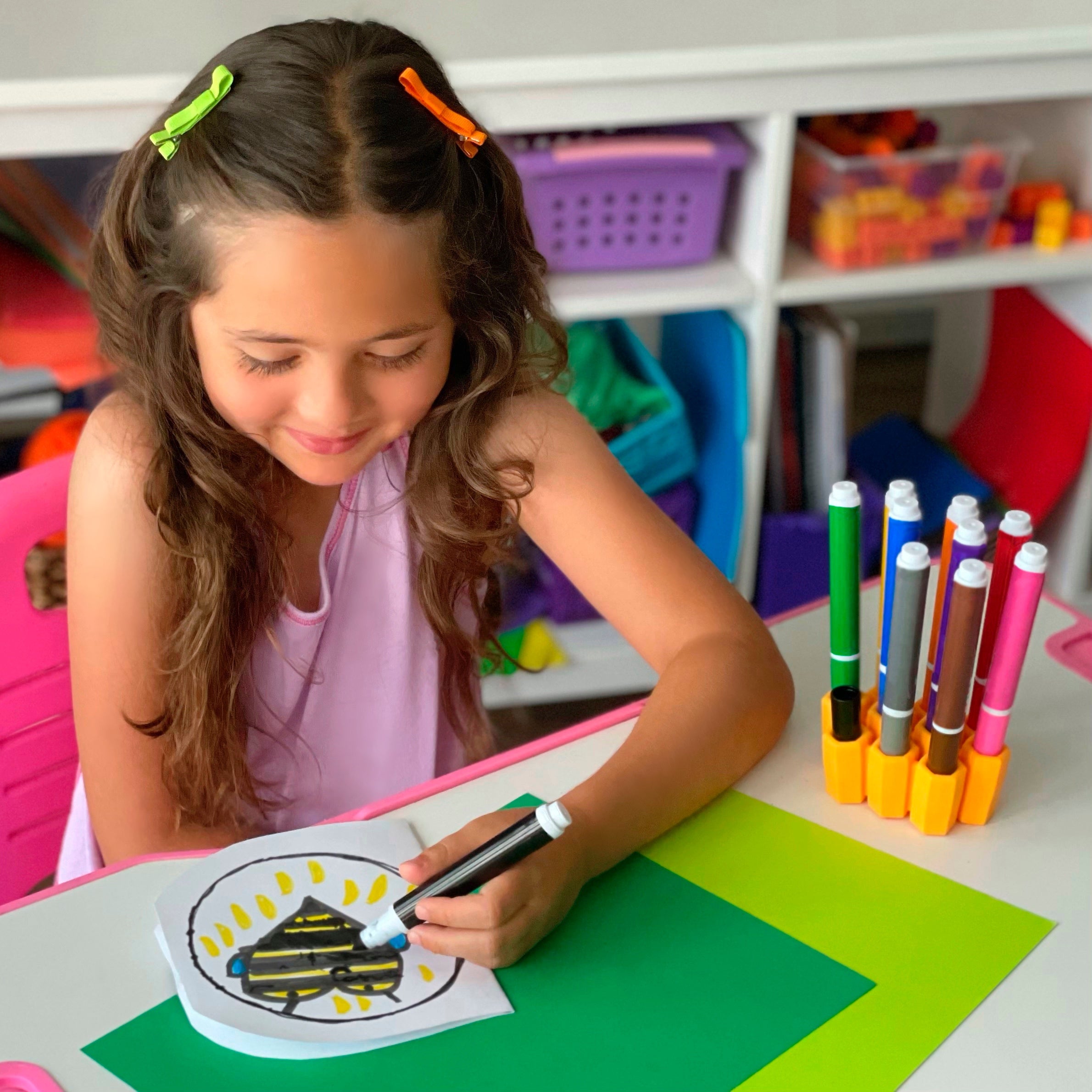
Marlo, the Little Bee, loves art. Fortunately for her, she’s great at it. (She definitely didn’t get that from her dad or me—it came from my mom, an artist and former elementary art teacher.) We try our best to encourage her interests, and art is no different. So she’s always had an arsenal of art supplies from pipe cleaners to paints. Our kitchen table could have easily been rebranded our arts and crafts table.
And the floor beneath a landing point for markers and caps that would inevitably roll off.
I would love to say that I would quickly spot them, recap them, and put them away, but I didn’t. Hey, I parent and I work, right? Can’t win ‘em all! That meant a lot of markers got dried out and thrown away.
Of course we tried to teach her to clean up her mess after art time was over, but that kind of thing takes time and patience to encourage and teach. When she started to approach six and a half years old, we started applying consequences. Uncapped marker that dried out? Not getting immediately replaced. One by one her favorite colors would disappear.
Then, on her half birthday (she’s a New Year’s Eve baby so we prefer to celebrate the half birthday over the whole), her aunt gave her an art set with clip markers, and my friend gave her a big pack of Crayola markers. Without being prompted, she set out to find a way to keep track of her markers and caps so these new markers didn’t meet the fate of her old ones.
And she did. At 6.5 years old, the first prototype of her invention was born.
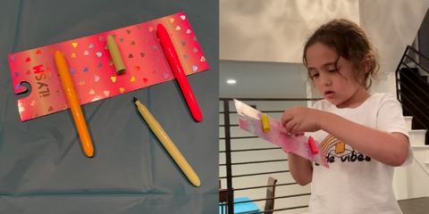
Her initial design was made for the clip markers. She used the cardboard packaging from a new pack of hair bows to create a holder for them that she intended to hang on the wall. (She immediately dismissed the bows—not her jam—but the cardboard backing was a win.)

After she was done, she came in to show me her design. Of course I thought it was brilliant and innovative. And of course (serial inventor that I am) I immediately consulted Google Patents. Was there anything like it? Nope.
Now came the fun part. Together, Marlo and I were going to develop this product for mass market.
First things first…
I began by explaining to her that as we develop, we stay married to the problem(s) we’re trying to solve, but not necessarily the way we first approached the design. The problems? Markers rolling off the table. Marker caps getting lost. Dried out markers getting thrown away.
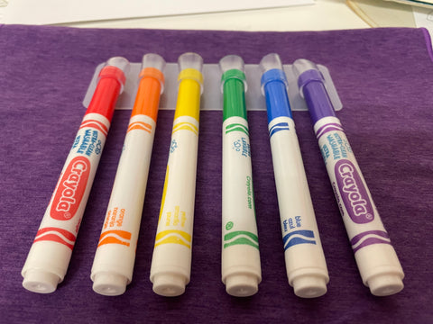
We quickly identified one adjustment that would have to be made. Her initial prototype was made to hold clip markers, and clip markers aren’t the most commonly used by kids. We knew we’d have to find a design that worked with a more common marker with a cylindrical cap.
So we headed over to our kitchen/art table with a bunch of household supplies and started playing. We both find it easier and way more fun to brainstorm in 3D. So we crafted a design out of Play-Doh. We crafted another one from styrofoam.


It took us a few iterations until we found the method we were going to use.
The design would hold the markers upside down and grip the caps, allowing a child to remove a marker without removing its cap. Since the marker cap always stays stuck in the same place, it couldn’t get lost. The child would know exactly where to find it when they’re done drawing with that color.
Don’t worry, the design still fit clip markers. It’s fun (and helpful) to honor Marlo’s initial design!
But how were we going to make them want to put their marker back? How would we help them remember to use their new tool? By making it bright, eye-catching, cute, and fun to use! The on-brand honeycomb design and our company’s signature marigold color fit the bill perfectly.
We knew what material to use pretty much immediately: silicone. We have a lot of experience with it (ScrubBEE, Build-A-Straw) and knew that it had the properties we needed. Its flexibility/elasticity would allow for the gripping of the cap while also allowing the cap to be removed when needed, its slightly squishy feel would allow a child to get a comfortable grip on it, and its resilience made it easy to clean and last for years.
Although we knew we were going with a honeycomb design, specific elements needed to be considered. Notice how the holes aren’t round inside the beehive? We loved that. Yes, its cute and goes better with the theme than a round column, but that’s not the best part. The corners of the hexagon gave us the wiggle room we needed for the best fit and user experience.
Off to a 3D design and 3D print we went! We had to print in a rigid material, but we knew the print would give us good enough information to move forward.


At this point, the design was slanted and the width of walls between the columns was very narrow. When Marlo tried to get a marker out, she couldn’t quite get her hand around the marker very easily. So the walls would need to be widened. Also, we saw that the slant wasn’t helpful in any way. The child was going to pick up the tool, so straight up and down would work best. Plus, a vertical design would take up less space on a desk or in a bag. Big bonus!
We knew we needed to try a sample with silicone next because we knew the function had a lot to do with what it was made of. So we went forward with the creation of a sample mold. This is the point where prototyping officially left our hands. The sample mold was made at our factory.


When we tested the silicone sample, we noticed two things: it was heavy and it only had nine columns. I should have noticed the latter issue after seeing the 3D print, but I didn’t. You win some, you lose some!
The product needed to fit a 10-pack of markers since that seemed to be the most common pack size—especially when used in classrooms.
Why did the heavy weight matter? Because silicone is expensive. It was best to eliminate any silicone that wasn’t needed for the function. Also, weight informs the cost of shipping. The higher the weight, the higher the cost. Since shipping rates have been rising steadily over the past couple of years, weight is something we’ve learned to consider before finalizing a design. Enter the column spacers. Easy adjustment.
Now for the durometer. Shore durometer is the measure of how hard or soft the silicone will be. The lower the number, the softer the silicone. The higher the number, the harder the silicone. It’s on a scale of 100 and we settled on 50. Not too hard, not too soft. Just right to firmly grip the cap while still allowing it to wiggle out with effort.
Updated 3D file, second sample and we were there! We went straight from there to the production mold. That meant we were very sure of our design, because once you make a production mold, you don’t want to change it. Not by much anyway.
That said, we just changed it. Do as I say, not as I do!
For Version 2.0 (in production at the time of this writing), we adjusted the interior of the columns to include a taper. Upon request by customers, Marker Parker 2.0 will fit both of the most common marker styles: broad tip and fine tip. And clip markers. And triangular markers. A worthwhile mold-adjustment investment!
One drawback, and that drawback’s only for us as the manufacturer/seller: more silicone had to be brought back in. We had to add material to the bottom portion of each column to create the tapers for the fine tip markers. So a greater cost per unit and higher shipping costs. But don’t worry, we’re not passing that cost on to our beloved customers!
By seven years old, Marlo had an invention in production, a patent pending, and then a product on the market.
And yes, she was involved in every single step. She participated in initial meetings with our factory. She tested and reviewed every design change. She can tell you about the material, including the durometer. She can tell you our cost and our retail selling price. They’re promoting STEAM education in schools (which I absolutely love), and it was an amazing experience to get to have an ongoing STEAM lesson in our home.

Having the opportunity to share my love of invention and product development was such a gift for me. Creating this business and developing products with my child has been one of the greatest experiences of my life.
